I felt the Amazon app was outdated, so I redesigned it using Design Thinking principles — a UX case study

I have been an avid user of the Amazon app for as long as I remember, both its web and mobile version. It has conveniently assisted me in purchasing stuff which I otherwise would not find in stores, especially rare books, even sneakers that suit my style and more.
With time as I gained more experience as a UX engineer, I started closely observing the additions being introduced into the app with a multitude of features that most people never got to discover (Amazon Programs, the scan item feature among other). One thing, in particular, bothered me about the mobile version: the information clutter present in most of their pages and the element of newness in their UI which the app severely lacks. So, I picked my pencil and piece of paper then started jotting down ideas that could potentially improve the usability of the app.
The Challenge: Pick a mobile application which I am familiar with and by utilizing measurable data from existing users and inspiration from modern visual layouts, try to optimize the app by making it accessible for users through a cleaner UI, reducing clutter and improving user flow.
The solution: Considering the factors and the user feedback obtained through the usability study I conducted, I propose a modified version of the Amazon mobile app that follows Amazon’s timeless branding, structurally arranged information (product details, description, and reviews), prioritizing the powerful ‘scan item’ feature and easier side-to-side comparison of items. This study is meant to provide insight into what aspects within Amazon’s mobile app can be improved or corrected to address the pain points of users, given the changes can significantly impact the company’s revenue generation with the paradigm shift involving people moving towards digital modes of shopping.
Amazon: A Bird’s Eye View of “The Everything Store “
Amazon.com is a widely popular platform used by people to purchase products based on their needs and wants. The application boasts one of the largest catalogs of products that range from books, clothes, electronics, toys to household items and makeup. The company started out in 1994 and currently is valued at $888.8bn, having hit the trillion dollar mark earlier in September 2018.
According to the Business Insider report; in 2018 alone, users spent an average 12.8 billion minutes per month (84.5% of total usage) in the Amazon app compared to 2.8 billion minutes per month (15.5% of total usage) on the browser version of the app, showcasing the massive conversion rate achieved through the mobile app.
Talking about the mobile app, it has loads of features that users get to discover with time but they are so many that most of them end up not being even touched. The app is regularly updated with the addition of advanced features and potential bug fixes that go towards enhancing the overall user experience. Each category of products has its own set of options to choose from which adds to the app’s complexity so there is no one-size-fits-all.

However, despite the massive user base drawn by the company, there is room to further improve the core workflow of the app that will go a long way in securing and retaining users, especially those within the younger age bracket.
As an aside, I did not have any access to the massive data that Amazon has collected over the years. All the decisions their development team has made is backed by years of analytics on user behavior, navigation, and purchase trends. With that in mind, the concept I present is not exhaustive and is solely based on data collected through guerilla usability testing.
Personal Goals
I was determined to carry out the project with the following goals in mind:
- To create a more enjoyable, accessible and clutter-free shopping experience.
- Drive UI design through empathy and Design Thinking.
- Create designs which are backed by data from the usability study. Use Proto.io to create refined, high fidelity mockups and
- Keeping the prototype consistent with Amazon’s brand identity
For the duration of the project I played the part of the following roles 1) User Researcher, 2) Data analyst, 3) UI/UX visualizer, 4) Product designer
Course of Action
As a starting base, I devised the project schedule, breaking down the project into milestones. I initiated a usability test to identify how key features are used within the current Amazon app framework and where there are shortcomings. I also tried to understand what features users are not aware of, in order to prioritize the feature content on the app for more visibility. The process below entails how I approached the problem statement and using the data gathered push towards updating the task flow and making amendments to the current UI for improved navigability and user experience.
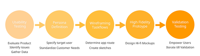
User Research & Usability Study
In order to understand a product’s user is to go meet them, talk them through the goals they want to achieve with the app and to empathize with them with regards to the pain points they share. I had the privilege to use Stony Brook’s computer labs to stage interviews for the usability study, bringing in 5 participants who were willing to share their experience with the app.
The purpose of the usability study was to identify bottlenecks in the current version of the app and funnels where the user is most likely to drop out of the app. So, I designed a short focused survey to gather preliminary data and feedback about:
- What are the demographics of the user? — age, gender, personality
- What category of products they usually shop for?
- Whether they research on other online/offline platforms before making a purchase?
- How would they rate their experience on the web and mobile version of the app?
After this, I carried out a timed test in which users had to perform set tasks which also involved using newer features they may not be aware of. The total time per interview took 30 mins.
Analysis & Findings
The users were open to providing their feedback about the visual design of the app. The general verdict declared the current version as outdated and the content placement, especially within the home and product pages, to be cluttered and sometimes overwhelming. The survey also supported that the average number of users are in favor of a UI makeover.
From the 5 conducted interviews and 30 responses from the survey, I derived the following analysis:
- 40% of the responders fell between the 18–24 age bracket while 53.3% fell in the 25–34 bracket.
- shop an average 2–3 times per month on Amazon (platform agnostic),
- are accustomed to using modern technology and find it easier to adopt newer technology.
- 22 of 30 responders consider themselves as introverts.
- 26 of 30 users would first research and read through the reviews before making a confirmed purchase
Some interesting findings from the survey:
- Household items are the most commonly shopped with 33.3% while the others buy electronics (30%)
- 80% of the responders said that they never got around to using the ‘camera scan’ feature or did not feel the need to.
- 60% of the responders associated convenience as the prime reason for using Amazon, 16% said navigability while 14% went for a variety of options.


User Goals: The goals Amazon users want to accomplish mainly revolved around the experience of buying a product as seamlessly as possible, potentially getting a bang for their buck. They want to save time going to a physical store and spending long hours traipsing through to find what they need. Also, when browsing through a product, a typical user would ideally check for reviews and see what others say before making a decision.
Pain points: Users shared a common sentiment that there is an overabundance of reviews on the product pages, irrelevant recommendations on their home feed and too many features that they do not particularly need.
User Persona & Branding
The diagram below is a depiction of what a typical Amazon user’s persona looks like based on the usability study and survey data gathered through the process:

Talking about the branding, the icon redesign above embraces the sleeker look adopted by several companies such as Instagram, Skype and Apple Music. Amazon presents itself as a technology company that continuously strives to become pioneers of new technology whether it is in the shopping space or in cloud technology. Even now the company is inching closer towards space travel. So it is not hard to imagine the company to change the outlook of the app if necessary.

The color palette below is resonant of Amazon and produces a mood of warmth, happiness, and joy which is associated with shopping at their online store. The darker colors are representative of the company’s corporate outlook, nicely balancing out the brighter colors.

Hi-fidelity Prototype
Part 1 of 4 — Reinventing the Product Page 📦
In a content-heavy app where the structural organization of information is critical to helping a user’s decision in purchasing a product. The workflow (showcased in the figure below) is designed to cater to the pain points exhibited by users.
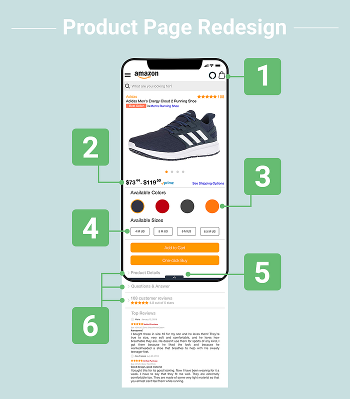
- The taskbar includes updated icons on a white background to give a more modern look
- The price range is set to bold to make it stand out for users. The See Shipping Options link on the right navigates to the list of products with the mentioned prices.
- In order to choose a color, the user has to make extra clicks to choose the appropriate options before adding it to cart. In this modified version, the user can slide through the options sideways without navigating away from the screen or opening a popup to highlight the color and size of choice.
- The same mechanism is applied in selecting the size of the shoe.
- The clickable arrow button opens to a task panel of two buttons that allows the user to add to a wish list or to compare with similar looking products.
- To address the challenge of information overload/clutter, the redesign makes use of accordion dropdowns that change state as the user clicks on it to display details.


Part 2 of 4 — Optimizing The Checkout Process 🛒
With the proliferation of e-commerce platforms and digital marketplaces, companies are pushing for more seamless ways to optimize the checkout process. Amazon’s checkout process is at least effective if not the most aesthetically appealing to the eye. Also, the app includes recommendations within the checkout process which are usually ignored by users, falling into the ‘out of sight, out of mind’ conundrum.
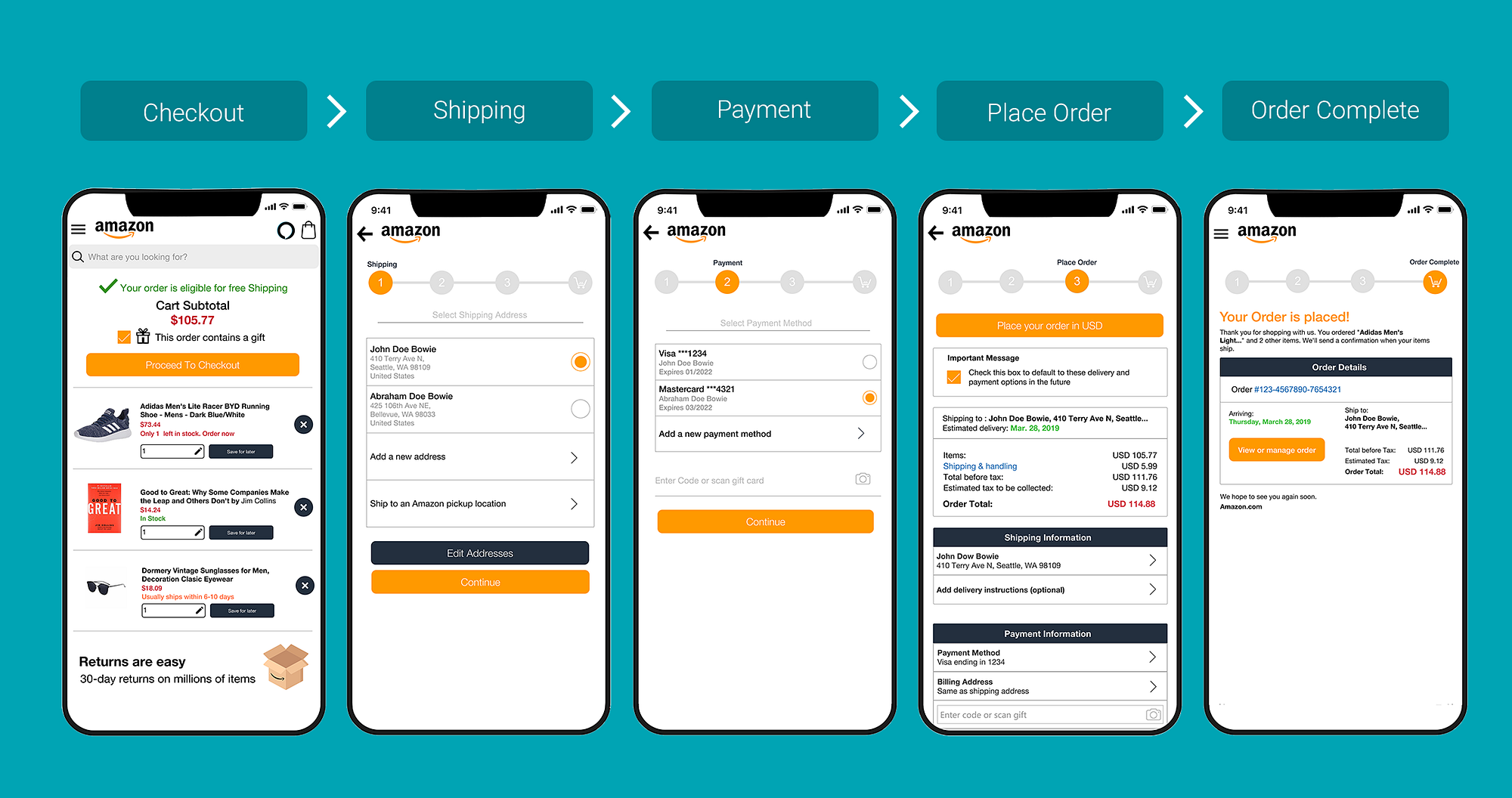
So in order to solve this issue, the Checkout page is kept clean by including only the most essential information without the need for the user to scroll down for recommendations. The user can update the quantity of the item, save it for later or remove it altogether. The order can be specified if it contains a gift item by checking the box. Upon clicking the checkout button, users have full visibility about which stage of the checkout process they are in, indicated by the circular navigation buttons.
In the Shipping section, the user can check the desired address where the items are to be delivered. There is also the ability to add a new address or selecting the nearest pickup location.
The Payment section is kept simple as well with the user selecting the payment option or add a new one. The user also has the convenience to scan their credit or debit card with a click of a button.
In the Place Order or Review section, only the most necessary details are displayed. Ample space is kept between the UI components for better readability.
Part 3 of 4 — Prioritizing the Scan Item button 📷
One of the more powerful features that the app recently introduced is the camera feature, where a user scans an item or uploads an image of an item to get results that are the closest match also suggest other relevant items available at reasonable prices.
Given the usefulness and effectiveness of the feature, I have given the camera scan its own button and for increased discoverability placing it below the sliding services section. The feature has a massive potential to boost online sales as users can compare products when shopping in brick and mortar stores to get better deals on the Amazon app!
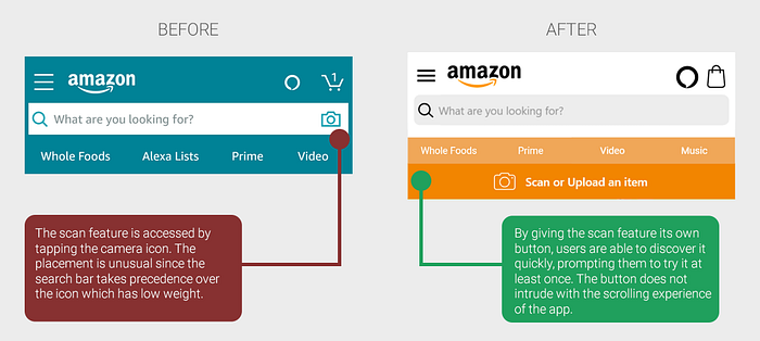
As a plus, it is better that users are given a short tutorial on how to use the feature. Clicking the scan button will trigger a pop-up explaining how to use the feature, facilitating users to give it a test-drive at least once.
Part 4 of 4 — Introducing Dark Mode 🌙
During the usability study, I made a hypothesis that users falling into the younger age bracket are more likely to browse the app in dimly lit rooms. Apps such as Medium, Twitter are content-heavy and people read through readable material before going to sleep.

The purpose of dark mode is two-fold in Amazon’s case:
- To save battery by utilizing the OLED screens of modern mobile phones
- In order to make it easier on the eyes for users when they are browsing through products or reading product reviews, questions and answers.
Participants were accepting of the idea that a night mode might actually increase their engagement with the app but there are trade-offs with respect to keeping a consistency in the app which can be a huge pain especially when dealing with images with lighter backgrounds.
Reflection and Future Work
This project presented a golden opportunity for me to work on my UX chops, getting into my creative zone to work on an interesting problem. I intend wholeheartedly to become a UX Engineer/product designer and during the past 4 months, I have learned to channel my creativity efficiently by understanding user requirements through empathy, working in an agile setting to iterate quickly in prototype creation, understanding bottlenecks within apps and eventually pushing myself to design a more optimal version of an app.
Its not about building the thing right, its about building the right thing
For future work, I would continue to gather more data about users and if possible onboard more candidates to test the current app in order to reduce existing errors and any confirmation bias.
I am working on more product design projects and creating magic. If you liked this read I have written another article on Typography:
If you want to discuss UX and design related projects. Hit me up on Twitter 😃


